2020-02-04 (1.1.4)
Usability Dinner
As mentioned in my previous post, I have been working hard to polish this project for the Usability Testessen. This event also forced me to concentrate more on the marketing part, i.e., creating a pitch and rethinking the target groups / use cases.
In 6 testing sessions (12 minutes each), 11 people gave me lots of feedback and ideas. Some issues were obvious, and I already knew I have to fix them (e.g. not being able to configure a widget in "edit" mode). Some issues I didn't realize (e.g. "How do I move a widget?"). And some ideas I didn't even consider until now (e.g. a dashboard background image).
The overall excitement for my Dashboard project wasn't overwhelming (maybe because I was the only non-startup at the event). However, one feature everyone loved was the Dark Mode. Don't ever underestimate this.
Project update
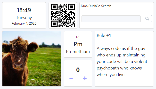
The UI design is rather pragmatic so far. I want it to stay minimalistic, but it doesn't have to look so boring. I've started applying some principles from Refactoring UI by introducing different font sizes and font weights. This alone makes the Date&Time and Chemical Elements widgets look so much better.
The widget drawer needs a major UI/UX redesign. The first step was to group all widgets by category.
This release contains some small bug fixes and improvements as well. One interesting thing I have learned is the inconsistent button behavior among browsers. This affected the Input clear button on macOS, which is now fixed.
Finally, I've increased the number of columns from 12 to 24 and adjusted the row height to provide a more precise widget sizing.
There was one more idea I've played with but abandoned for now: fluid typography. Currently, the font sizes are pretty much fixed. The user has to resize the widget to a size where all the content will fit into. I thought it would be nice to have the content match the widget size instead. However, there are some issues with this idea:
- There is no native CSS way to achieve this. The best workaround I have found was to use
transform: scale()(cross-browser version forzoomso to say). But it's fragile and requires some pixel-perfect adjustments. - Some widgets shouldn't scale with the widget size (e.g. notes, website). One could turn off the scaling for selected widgets, but then the look&feel wouldn't be as consistent anymore.
- The overall motivation for this idea is to enable the user to see a larger version of some widgets. That is already possible by using the browser zoom feature. I should probably improve the UX by adding some buttons to control the zoom level.